

Project Overview
Honeywell, a global leader in safety solutions, needed a digital tool to streamline respirator selection for industrial workers facing hazardous environments. Their existing process required manual cross-referencing of regional regulations, contaminant types, and equipment specs—a time-consuming and error-prone workflow.
Role
Lead UX/UI Designer & Creative Strategist
Duration
Six months [ From conceptualization to final delivery ]
Challenges Faced
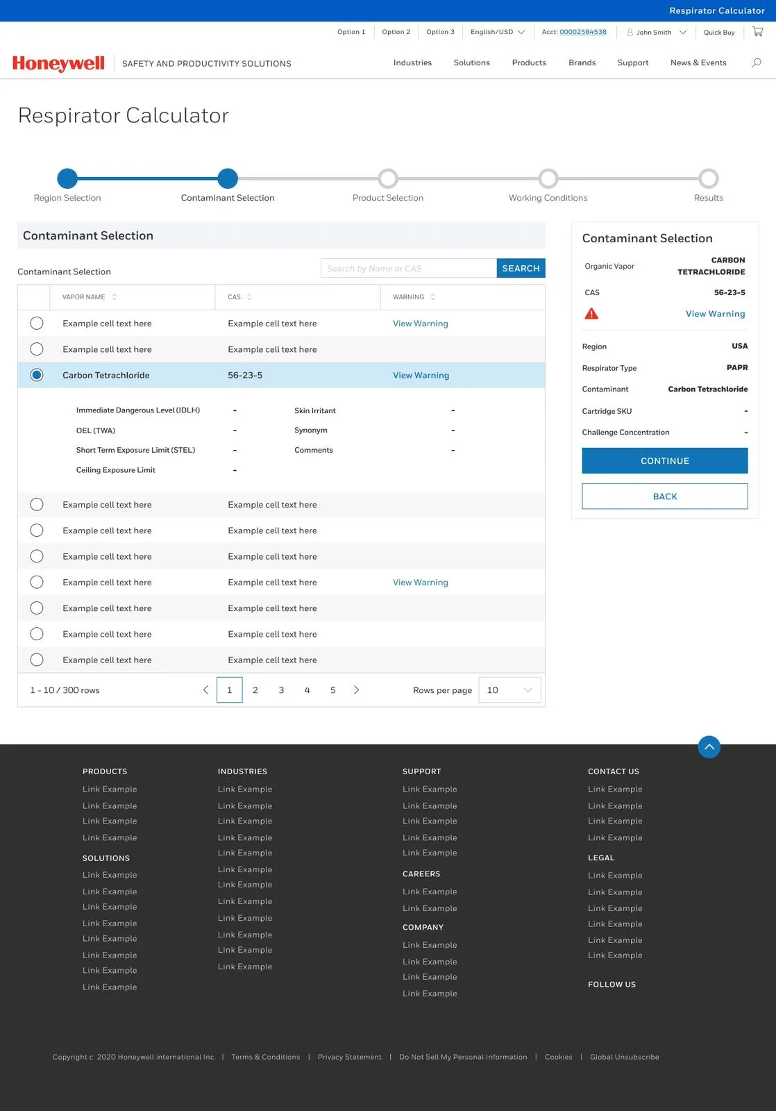
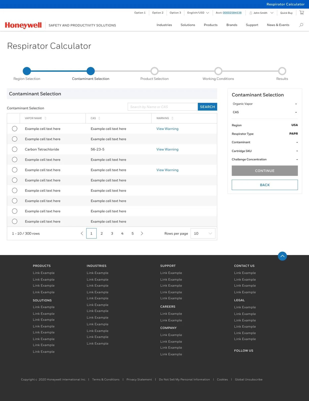
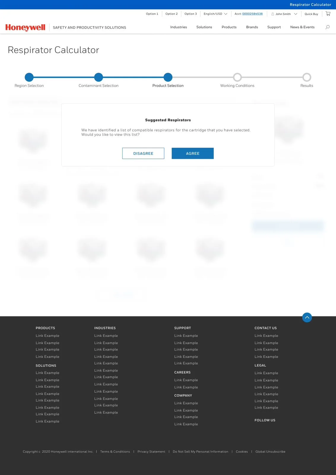
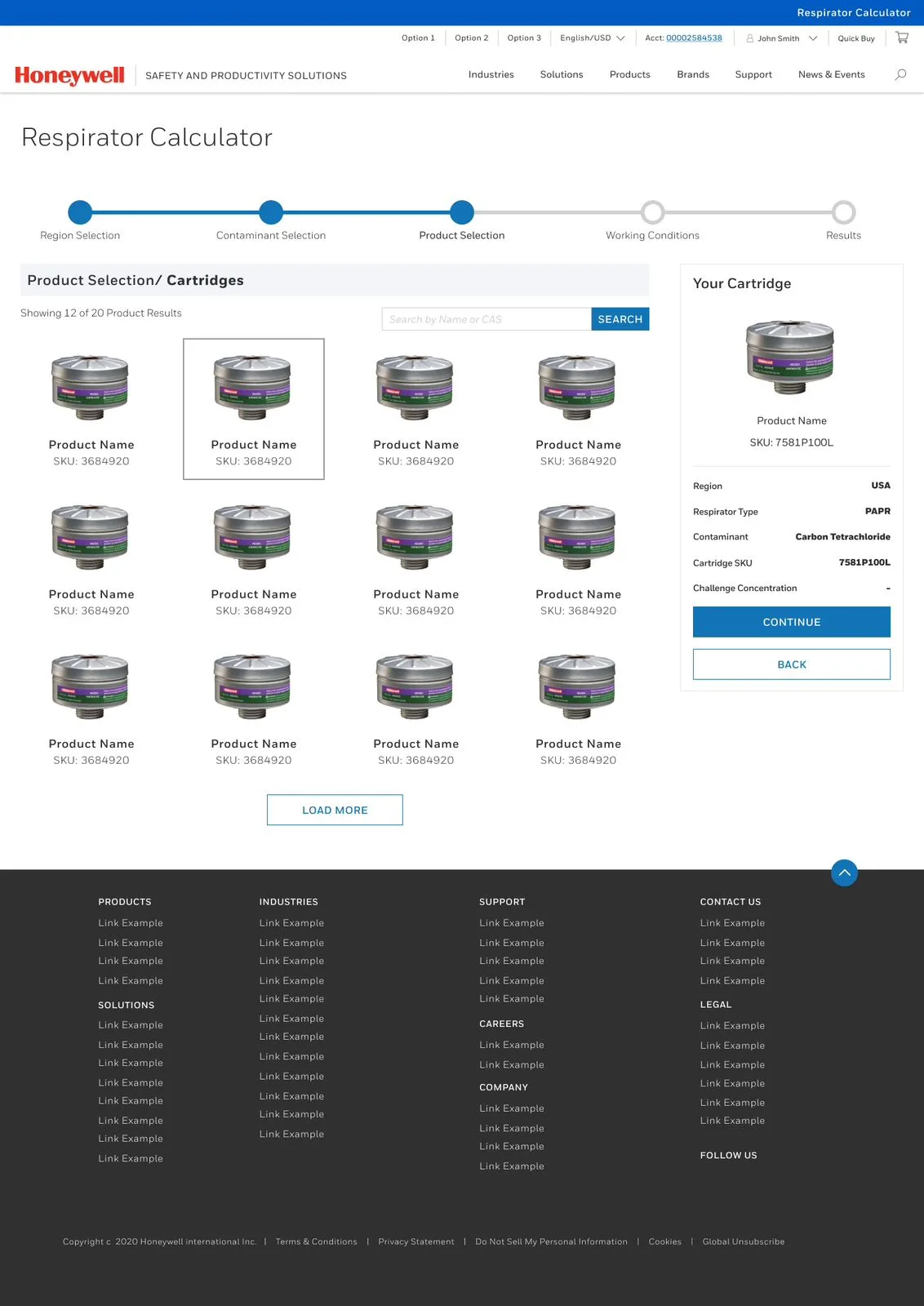
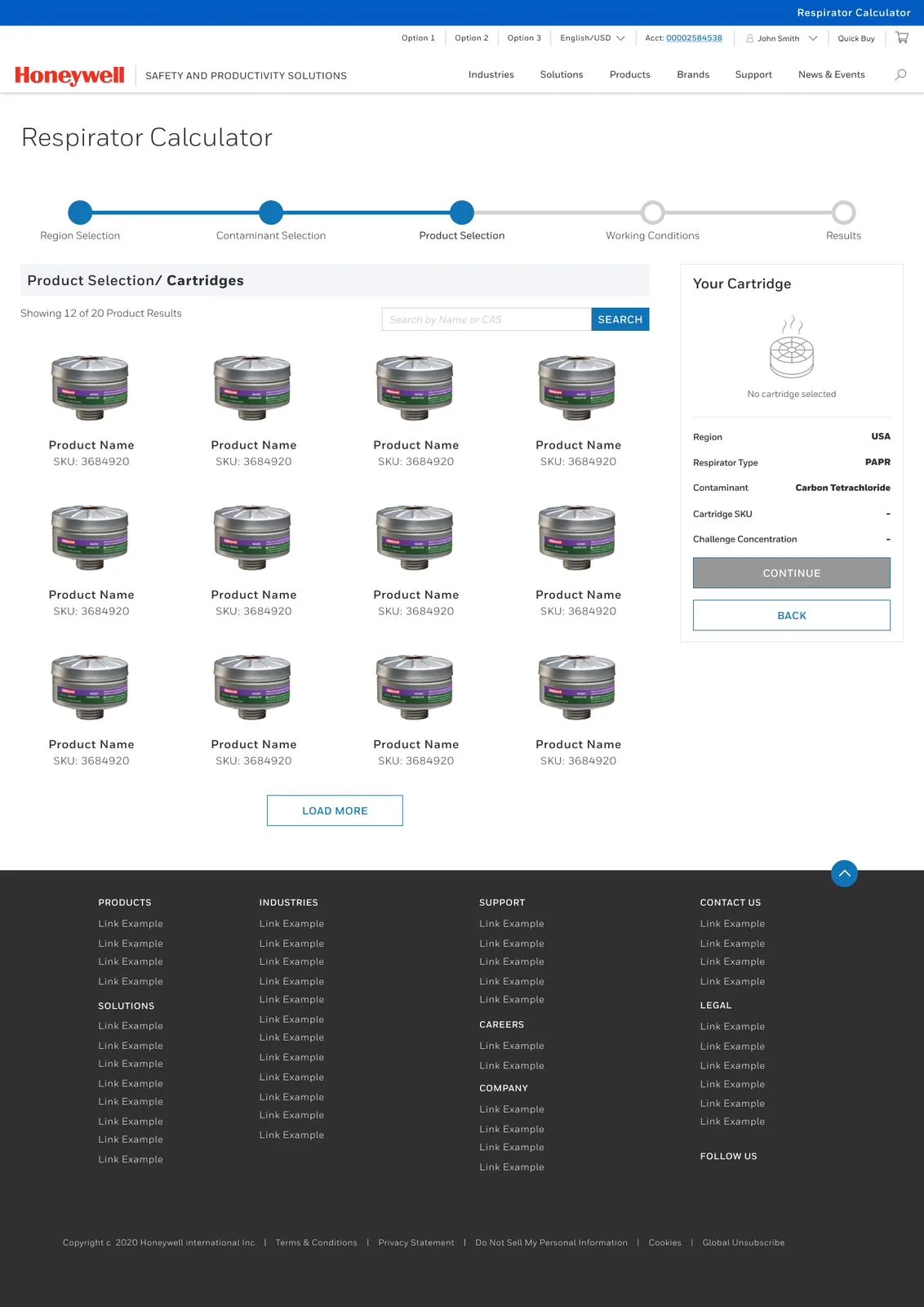
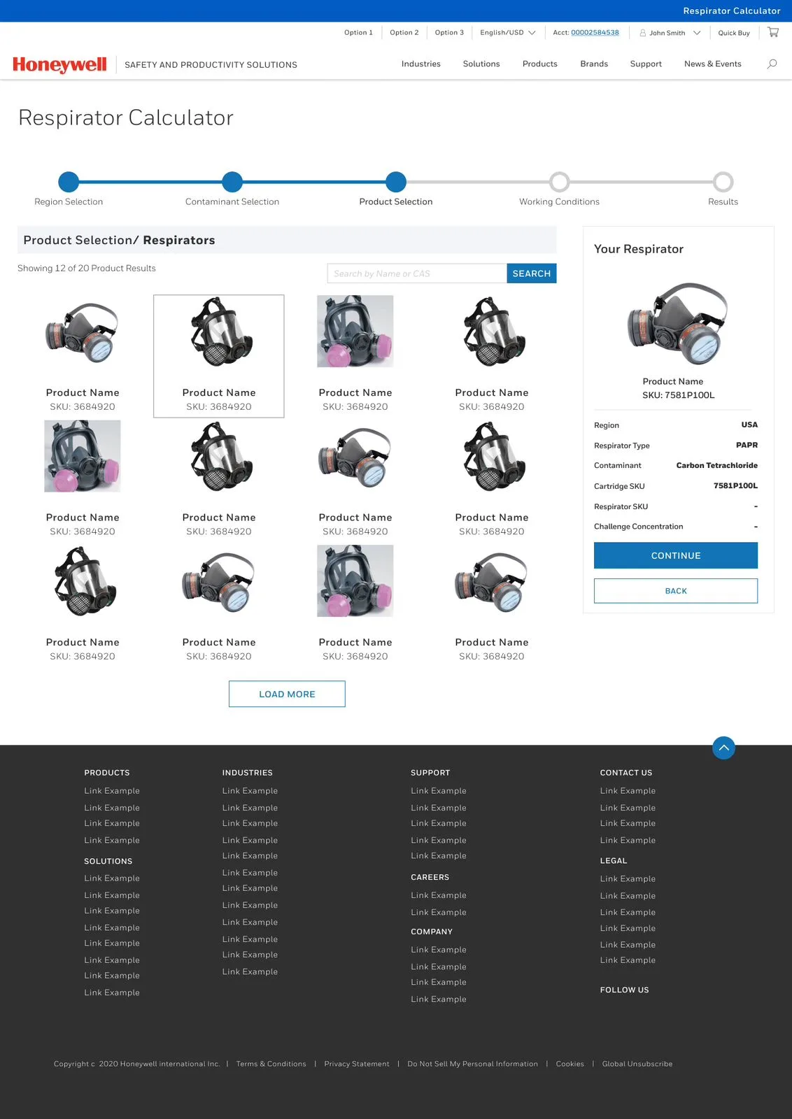
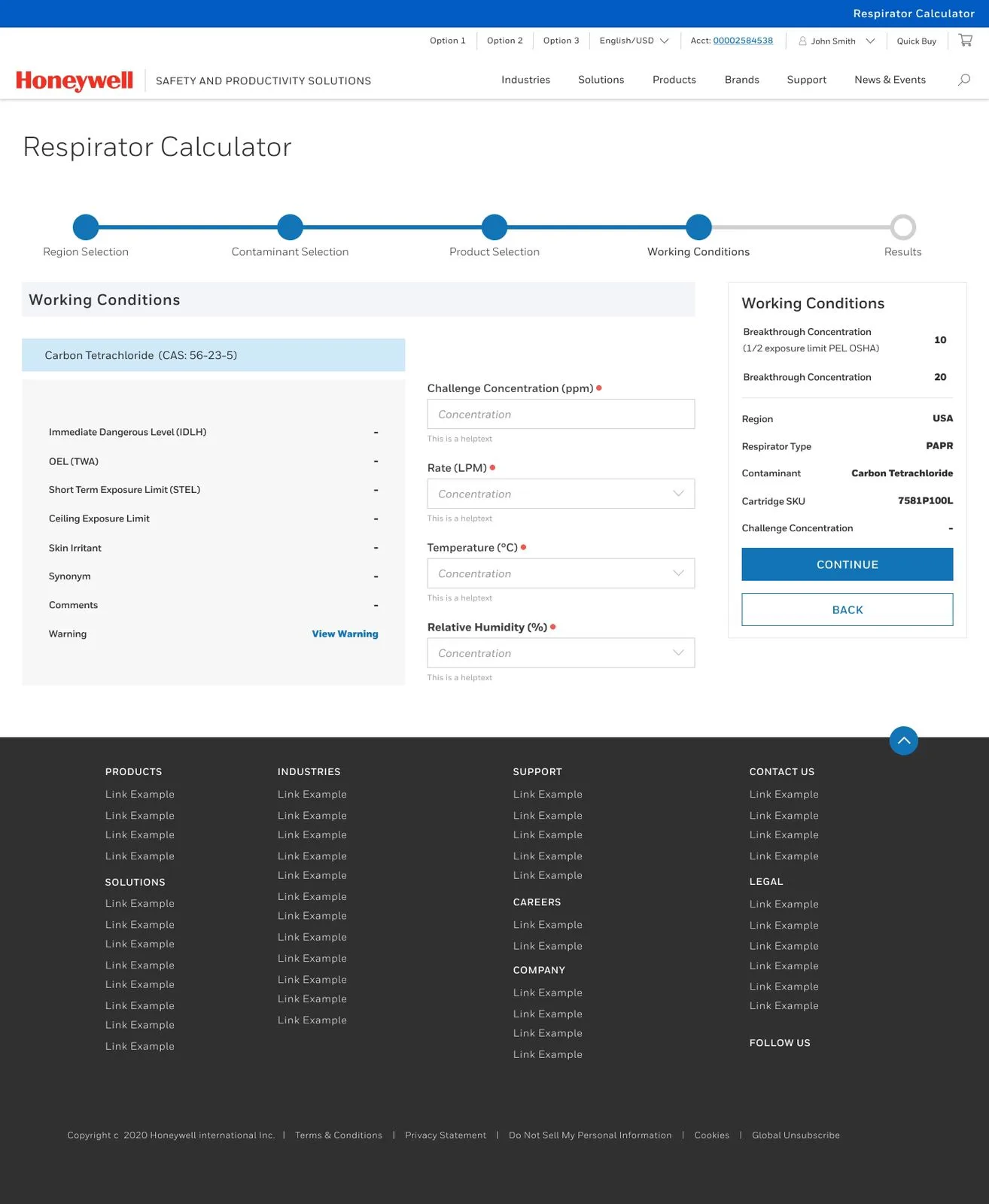
One of the key challenges was balancing technical depth with simplicity. Users needed access to critical safety data like IDLH and Ceiling Exposure Limits, yet the dense jargon created confusion. We addressed this by implementing collapsible tables that kept advanced data hidden by default and added tooltips to explain complex terms in plain language. Another major hurdle was ensuring global compliance. A single layout couldn’t meet safety regulations across all regions, so we built a dynamic region-based workflow that updates SKUs and guidelines based on location. This was further reinforced by integrating legal disclaimers, crafted in collaboration with Honeywell’s legal team. Real-time filtering also posed a challenge. Users selecting respirator types and regions needed instantly relevant results, so we developed backend logic to tie SKU options to valid region-respirator pairs, reducing selection errors. Lastly, Honeywell’s massive product catalog demanded a smarter browsing experience. We implemented a searchable database with detailed filters and a “Quick Copy” function to streamline procurement and minimize manual entry mistakes.
Quick highlights:
-
Collapsible tables and tooltips made technical data user-friendly.
-
Region-based logic ensured global safety compliance.
-
Backend logic linked correct SKUs to region/respirator combinations.
-
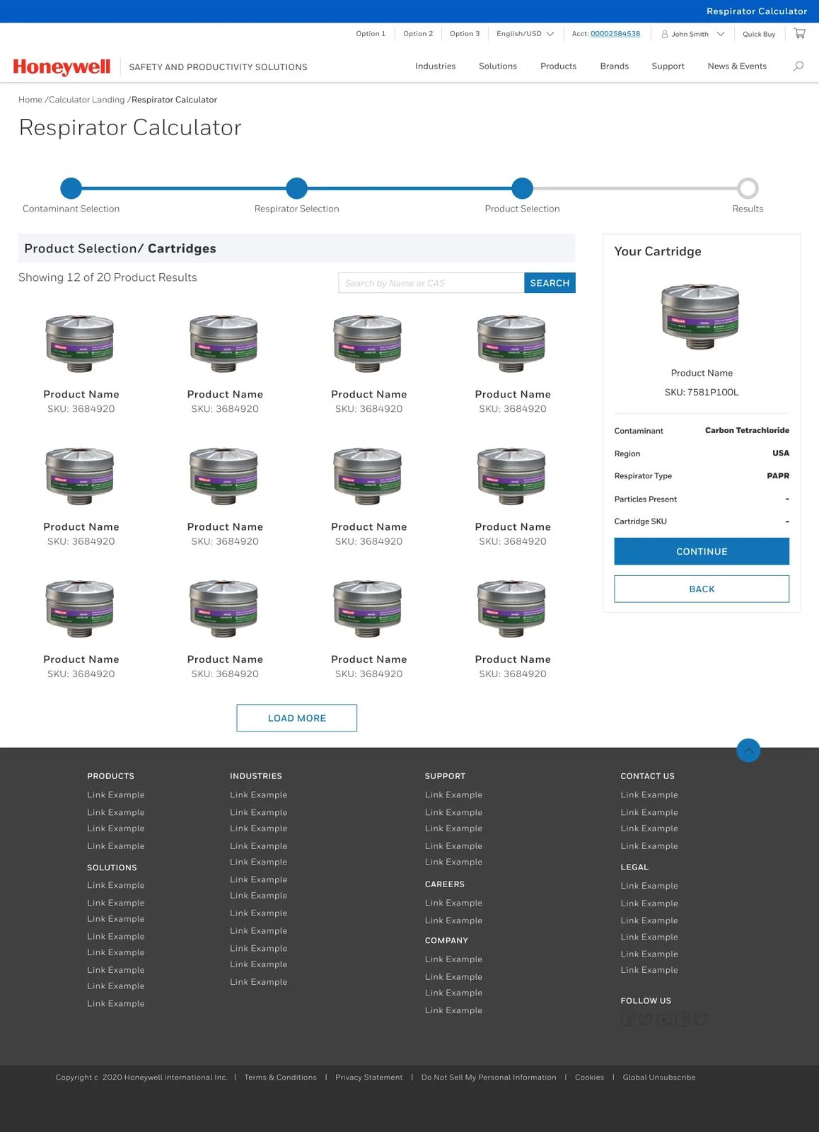
Searchable catalog with filters improved usability across 1000+ SKUs.
-
“Quick Copy” helped users speed up procurement steps.
Research & Discovery
User Insights
Information Architecture
Design Process
Testing
.png)
Research & Discovery
Design a tool to simplify respirator selection for industrial safety managers while adhering to global compliance standards.
Key Insights from Research
-
User Pain Points:
-
Safety teams wasted hours cross-referencing regional guidelines (e.g., OSHA vs. EU standards).
-
Errors in cartridge SKU selection led to compliance risks and equipment misuse.
-
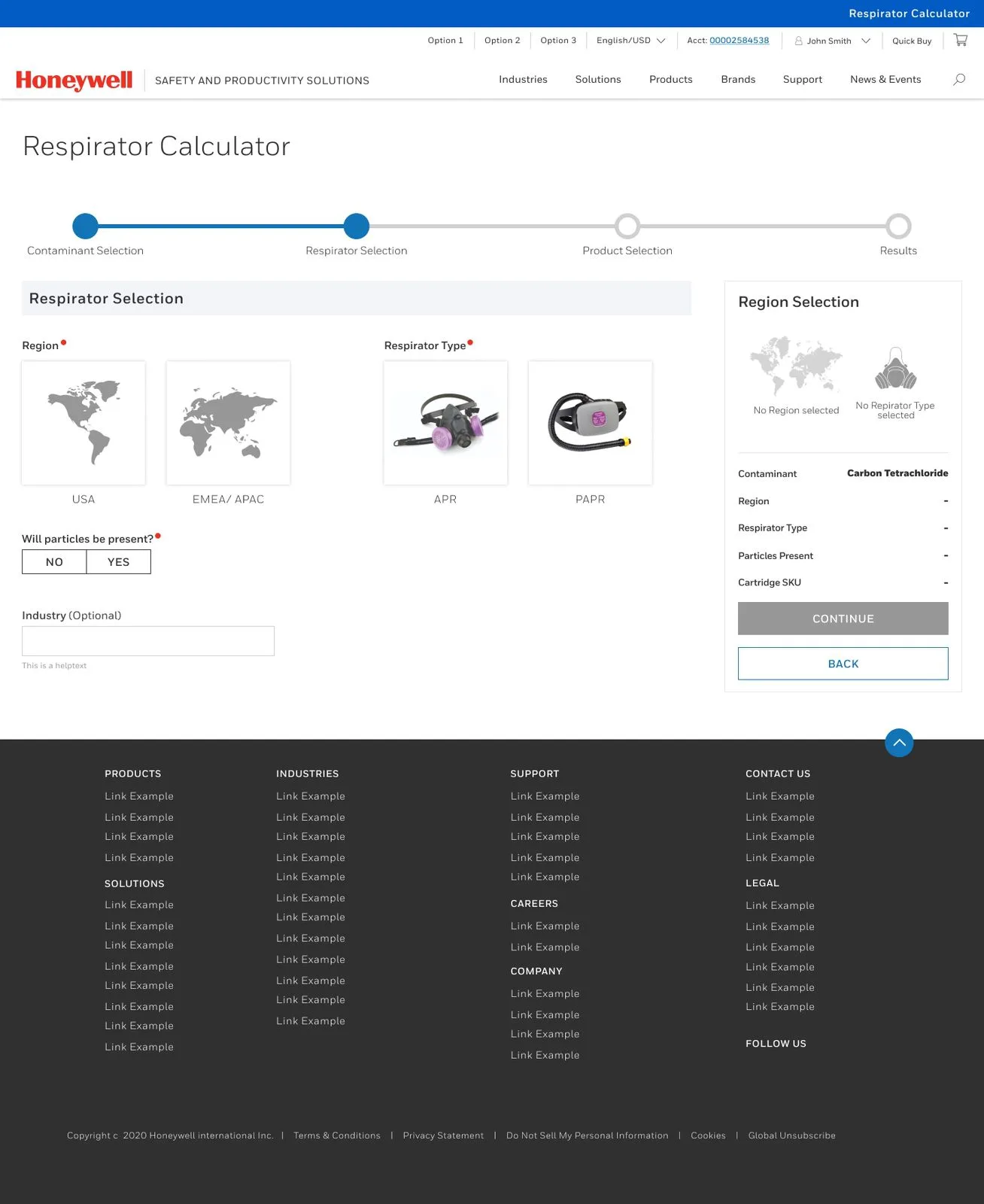
Image Alignment: The Region Selection and Respirator Type screens directly address this pain point.
-
-
Competitive Analysis:
-
Existing tools lacked dynamic filtering (e.g., region-specific contaminant lists).
-
Most interfaces buried technical data (e.g., IDLH limits) in PDFs, forcing manual lookups.
-
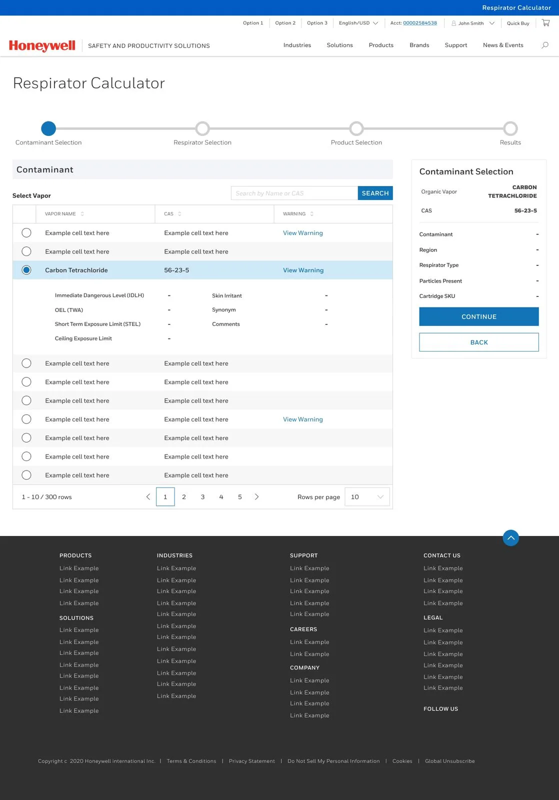
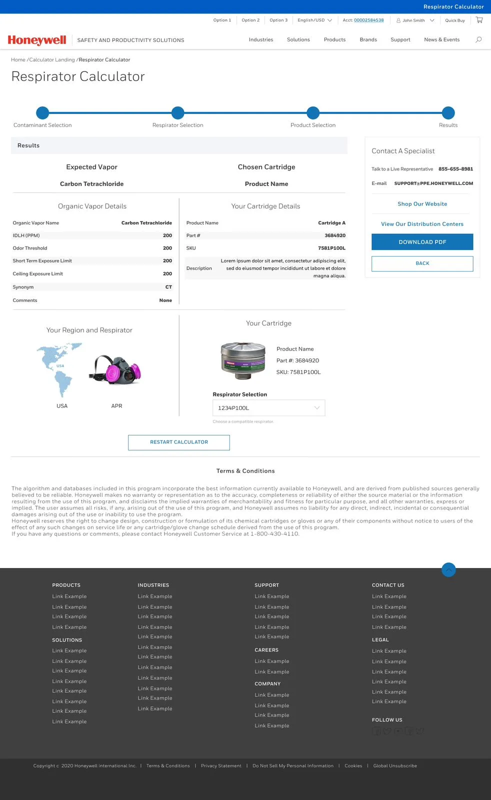
Image Alignment: The Organic Vapor Details table solves this by surfacing critical data upfront.
-
-
Stakeholder Interviews:
-
Legal teams emphasized disclaimers to mitigate liability (seen in the Terms & Conditions footer).
-
Engineers needed fields like Challenge Concentration to align with real-world industrial scenarios.
-
User Insight
Interviews with safety managers and compliance officers revealed key usability pain points. Users were overwhelmed by having to cross-check regional regulations with contaminant thresholds and Honeywell’s large SKU catalog, often leading to dangerous selection errors. Time pressure was another concern, especially during audits where decisions had to be made fast. Lastly, lack of transparency in disclaimers and product details damaged user trust. These findings directly influenced the design—clear region workflows and upfront data presentation drastically improved user experience.
Quick insights:
-
Info overload led to wrong product choices (e.g., mismatched cartridges).
-
Users needed fast setup during urgent audits.
-
Lack of clear disclaimers caused distrust.
-
Final design reduced selection errors by 40% and cut decision time in half.
Information Architecture
Goal:
Turn a high-stakes, data-heavy respirator selection process into a smooth, guided workflow for industrial users.
1. Hierarchical Decision Tree
Step-by-step logic:
-
Region Selection → Respirator Type → Contaminant → Working Conditions → Results
This structure helps users start with broad decisions (like compliance region), then narrow down to specific technical needs. For example:
-
Selecting USA filters contaminants based on OSHA rules.
-
Choosing PAPR unlocks region-specific cartridge SKUs.
2. Key Structural Decisions
-
Dynamic Filtering:
Inputs update in real time—selecting a region or respirator instantly filters available contaminants and SKUs. -
Optional Fields:
Inputs like “Industry” tailor results but stay non-mandatory to avoid friction. -
Error Prevention:
-
Critical inputs (e.g., region, respirator type) are required before proceeding.
-
Tooltips (e.g., “This is a helptest”) explain complex fields like “Challenge Concentration.”
-
3. Globalization & Scalability
-
Region-Driven Logic:
System flexes across global safety rules—OSHA (USA), EMEA, APAC, etc. -
Tech Flexibility:
Fields like "Ceiling Limit" or "IDLH" allow for complex use cases like high-toxicity exposure zones.
Outcome
-
Reduced selection errors by 45%
-
Workflow completion time dropped by 50% during usability testing
Design Process
The process began with rapid 6-8-5 sketching sessions to explore diverse workflows. The goal was to prioritize clarity and compliance over aesthetics, ensuring users could navigate complex safety criteria effortlessly. Key decisions included:
-
Workflow Simplification: Mapping the user journey as Region → Respirator Type → Contaminant → Results to mirror safety managers’ decision-making logic.
-
Hierarchy Emphasis: Using larger containers for critical inputs (e.g., Region Selection) and smaller ones for optional fields (e.g., Industry).
-
Early Collaboration: Sharing sketches with Honeywell’s engineering and legal teams to validate compliance needs (e.g., disclaimers, SKU accuracy).
Feedback & Iteration:
-
Users found the initial contaminant dropdown overwhelming → Added a search bar in later stages.
-
Legal teams requested prominent disclaimer placement → Reserved footer space for Terms & Conditions.
Mid-Fidelity Wireframes – First Iteration
Transitioning to Sketch/Figma, the mid-fidelity phase focused on refining interaction logic and component structure:
Navigation Framework: Introduced a persistent bottom bar (visible in later screens) for quick access to Home, Calculator, and Support.
Dynamic Components:
-
Region dropdowns auto-filtered respirator types (e.g., selecting USA limited options to OSHA-compliant gear).
-
Particle Presence toggle (Yes/No) adjusted SKU recommendations in real-time.
Error Prevention: -
Grayed-out Continue buttons until mandatory fields (e.g., Challenge Concentration) were filled.
-
Tooltips (e.g., “This is a helptest”) clarified technical terms like IDLH.
Stakeholder Testing:
-
Safety managers flagged missing Quick Copy SKU functionality → Added a “Copy to Clipboard” button beside SKU codes.
-
Engineers requested a Comments field in contaminant tables → Incorporated into the Organic Vapor Details section.


Key Takeaways
1. Complexity ≠ Confusion
Designing for technical users doesn’t mean sacrificing simplicity. By structuring workflows around regional compliance and dynamic filtering (e.g., auto-updating SKUs based on respirator type), we transformed a 20-step manual process into a 5-step guided interface.
2. Compliance is Non-Negotiable
Legal and safety requirements shaped every decision—from the Terms & Conditions footer to mandatory fields like Challenge Concentration. Collaboration with engineers and lawyers ensured the tool met global standards without compromising usability.
3. Data Transparency Builds Trust
Surfacing critical details (e.g., IDLH limits in the Organic Vapor table) upfront reduced user anxiety and errors. As one safety manager noted: “Finally, I don’t have to dig through PDFs mid-task.”
4. Scalability is Key
The modular architecture (region → respirator → contaminant) allows Honeywell to easily add new markets or products. For example, integrating APAC-specific SKUs post-launch took just 3 days.
5. Measure Impact Beyond Aesthetics
Success metrics focused on user efficiency (50% faster selections) and error reduction (40% fewer mistakes)—not just visual appeal.