Design Challenge: Onboarding
- Avital Donner

- Apr 16, 2025
- 3 min read
For this week’s blog post, I decided to focus on my recent design challenge from Daily UI.
Design challenge:
Design something onboarding related. Are you recruiting people for an organization? To sign up for a new website? A mobile app?

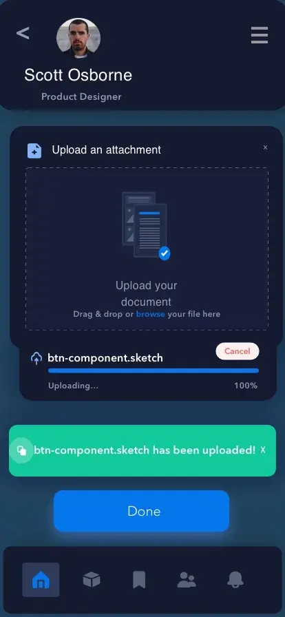
When considering this challenge, I thought about all of the onboarding screens I have created in the past for different projects. Onboarding screens are vital to an app and website, whether to explain what the app does, portray exciting features of the app, or create a pain-free signup experience. When a person downloads an app, these are the first screens they will see before proceeding to the homepage. These onboarding screens can make or break your app with a single glance.
What do people consider when swiping through the initial screens?
There are many things that are considered when a person first downloads an app and swiped through the onboarding screen. If someone doesn’t like the colors that were chosen to represent the app, the layout of the screens, or the content that is provided, they might just deicide to delete this app and find one that works better for them. Additionally, if a person sees too much content in the initial screens, with paragraphs of information about the app, they will most likely skip it entirely. Every user wants a simple, pain-free onboarding experience that is aesthetically pleasing and impressive enough to make to user continue on to the homepage. Sometimes, if a user is interested enough in the app, they will proceed to register with the app (if registration is required). Other times the user will skip registration and continue as guest in order to make a more informed decision on whether to sign up for the app after viewing the homepage and other content.
How do you get a user to register during onboarding and not skip registration?
As stated above, every user wants a simple, pain-free onboarding experience that is aesthetically pleasing and informative enough to understand what the app provides without being too wordy. An important aspect to keep the users engaged is by having delightful images. Additionally, as stated above, a pain-free onboarding process is crucial, especially to millennials and Gen-Zers who are growing less and less patient as technology enhances. This means that too many screens to swipe through and fill with information will be seen as a deterrence to continue with the app. Creating an account can be a simple, easy task, or it can be an annoyance. If it is an annoyance, then users will be less likely to engage in the app.
What is too many onboarding screens?
Onboarding screens can provide different functions. There are the screens that give a quick rundown on what the app provides, the sign up/ login screens, and then there can be screens asking the user to answer specific questions or provide information in order to tailor the account to include exactly what the user needs. These are all important functions, and it is possible to use all three as long as they are concise. Swiping through ten onboarding screens is not ideal for user that just wants to get to the homepage, or is deciding whether or not continuing to use this app makes sense for them. As we all know, there are many options for different apps, and you want to lose users to competing apps. Therefore, in my opinion, for the initial screens there should be no more than three screens displaying the different and exciting features of the app. Additionally, sign up and login should require as little information as possible, keeping with username and password if possible, because people are less inclined to divulge more information about themselves. Lastly, if your app requires additional information for someone to provide about their specific needs to personalize each experience, screens should be simple and easy to use, and take no more than a few minutes to complete. Furthermore, there should include an option to skip these questions if the user would rather go straight to the homepage.


Comments